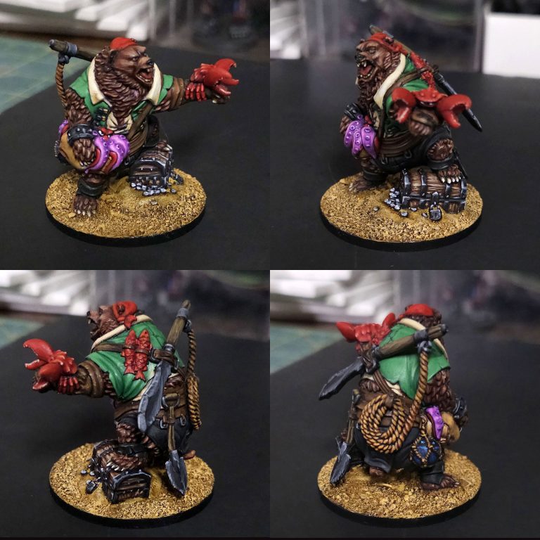
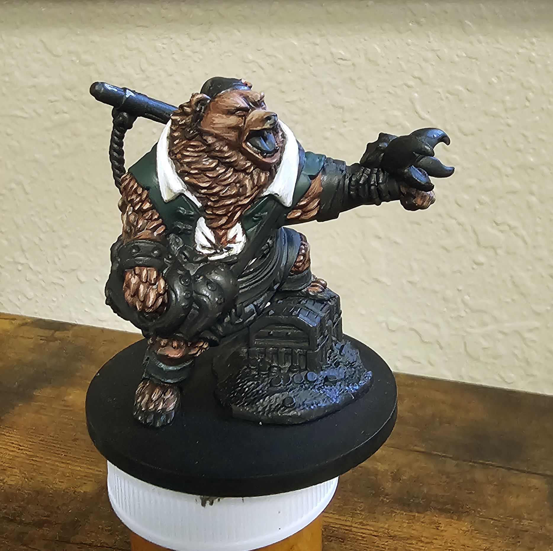
Charlemagne – Pt 5
Put some time in over the last week on Charlemange. Black leather boots and cloth pants and finally some color with his green vest.
I’ve always wondered what my “style” is, if I have one, when it comes to painting minis. I did cut my teeth on 2nd/3rd edition Orks and while the 2nd ed was primary color based, bright, and lacked depth, I wasn’t a fan of the “dark and dirty” of 3rd edition on.
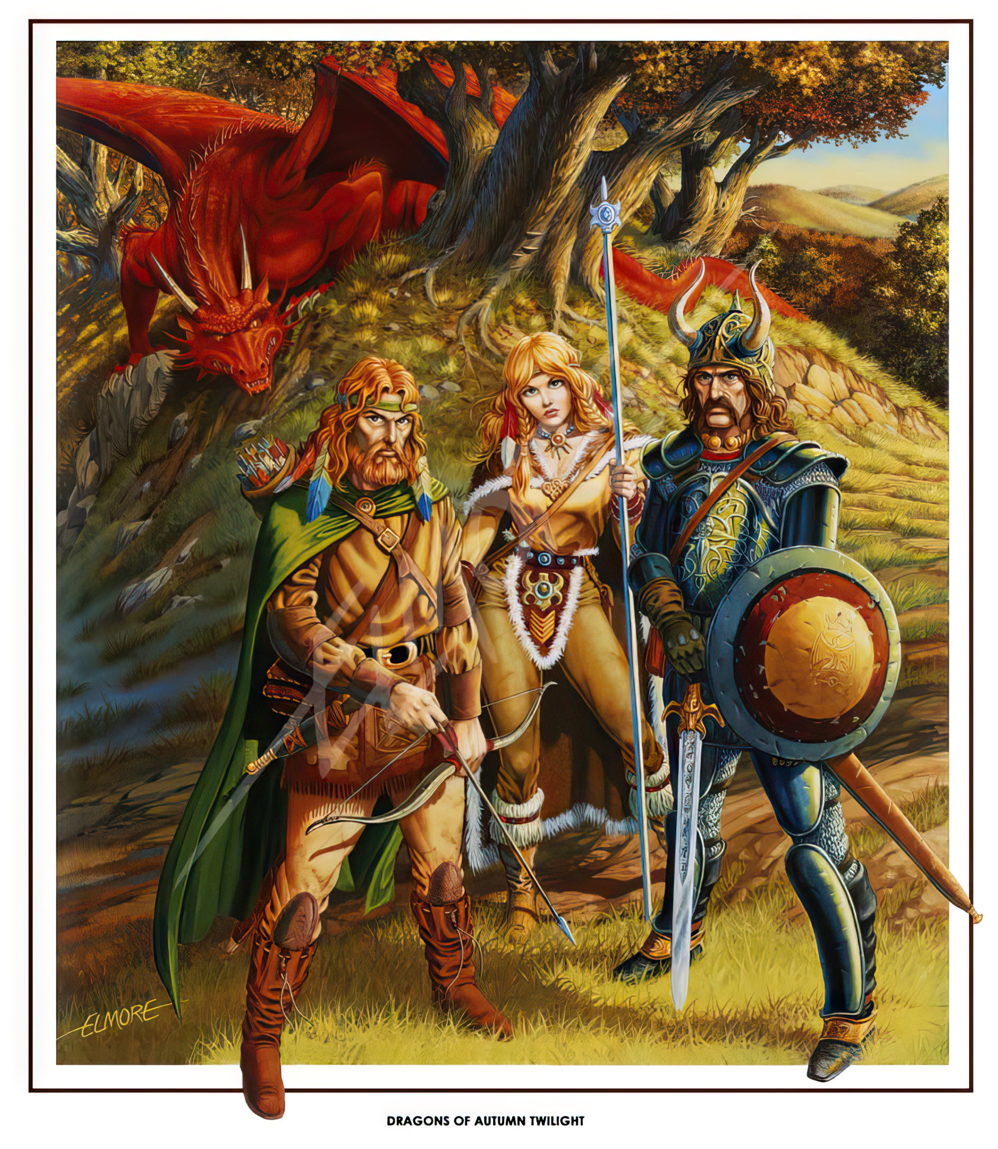
While driving today, I came to the realization that I like brighter, higher contrast paint schemes, and realized I’m probably most influenced by the “Four Horsemen of the Artpocalypse”; Elmore. Easley, Caldwell, and Parkinson. These four artists almost single-handedly created the design aesthetic of Dungeons and Dragons from the early eighties to the early nineties. Most of their art is highly saturated, lots of drama, and high contrast – just waht was needed to capture the eye, and imagination, of young people looking for escape.
Looking back at the previous years of my mini painting and there’s no mistaking the comparison. With that, on to the mini 🙂
I tried experimenting with the leather boots by using a green color cast to “make things look more interesting”. A concept I saw mentioned a few times online when painting leather. The idea is that black leather, while black, isn’t really “all, or only” black. There’s always some sort of environmental reflections that may add a subtle color cast to the material. The suggestion was to find a color that harmonizes with your models color scheme and go wit that. I used a green that will be similar to the vest I plan on painting next. I’m not 100% sure I pulled it off, but, as they say, “Trust in the Process”, so I am.
The cloth pants were pretty straight forward, Black shadows up to a dark/mid grey. I don’t want to go too far as A. black cloth isn’t typically bright or reflective, and B. I wanted to simply show that there’s something there without drawing the attention away form the important part, the face and visual center of the model.
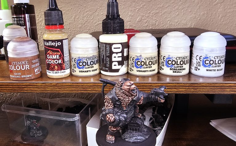
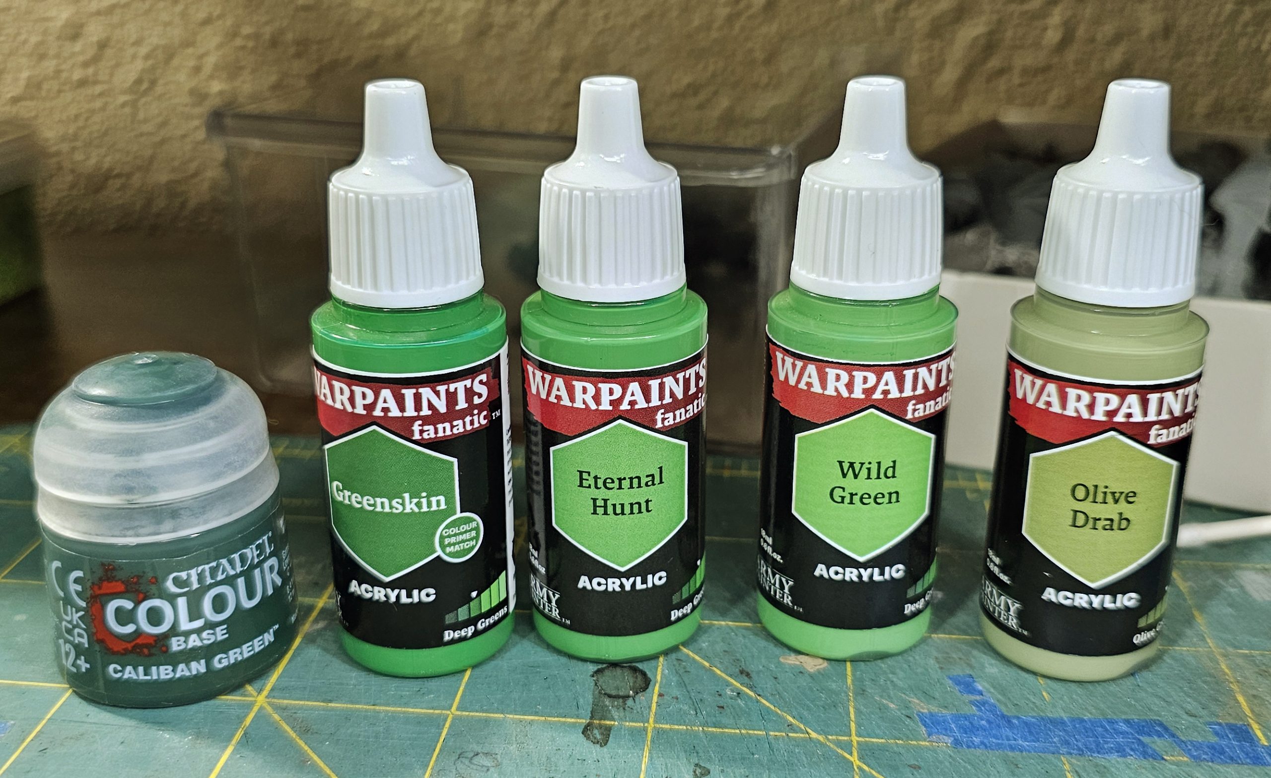
As for the vest, I wanted a lighter, forest green as the main mid-tone. Something somewhat bright, but not over saturated. Again, keeping with the concept of drawing the eyes to the face. My color progression for the vest was Mostly using Army Painter paints. The base was Citadel’s Caliban Green. While this is on the cooler, blue tinted side, t was what I had on hand, and since it’s basically a base for the lighter colors to work on, I don’t think it was going to influence the final layers all that much.
From there, it was a mix up from Greenskin –> Eternal Hunt –> Wild Green – Caliban Green wash –> Eternal Hunt –> Wild Green.
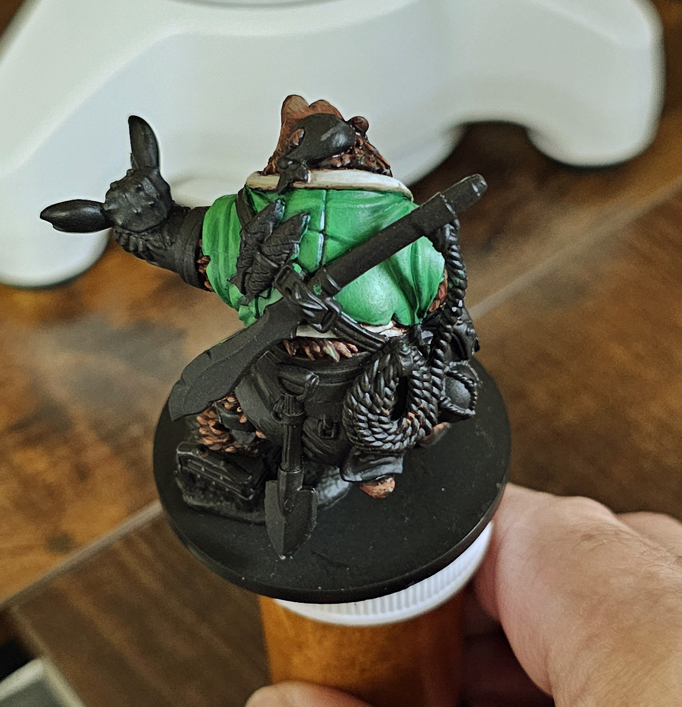
Aaaand, the finished result.
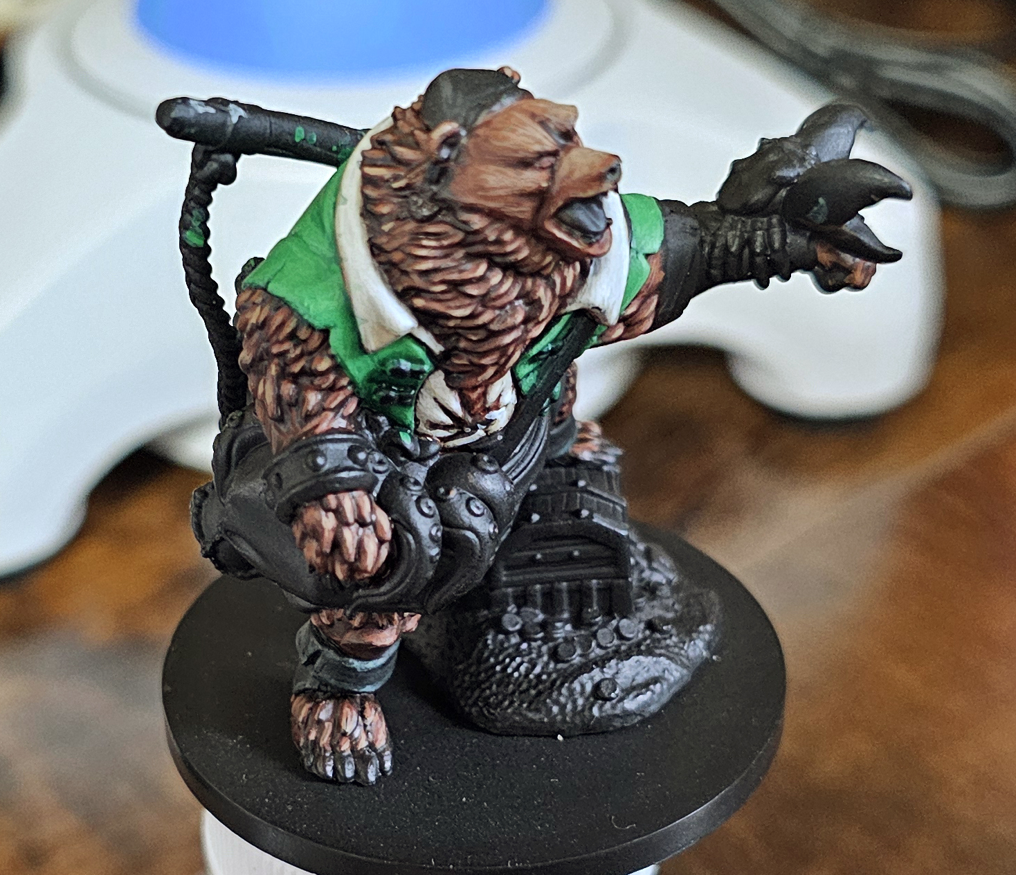
Even before painting the vest, I was second guessing how light and bright the collar for the undershirt was – it seemed too bright and overpowered the brown fur but I figured I’d wait until the vest was done to make the final decision. And, my initial concern was founded. While it is bright and high contrast, it’s too much for the final look I want so I’ll be going back with some warm brown tone washes to breing it back to a more cream color rather than a bright white it ended up being.
Later!