A Homecoming, Of Sorts

The last time I painted any ork skin proppa was in 2013 with my Dakkajet pilots. That was 13 years ago, and a lot has changed since then. If I’m not mistaken, there’s been four different painting techniques invented since then, and there isn’t a single paint that I used to use in existence. Everything back then was layers, washes, and blending. Now, there’s slap chop, zenithal priming, over painting, 5 different paint types to choose from to achieve ones goals.
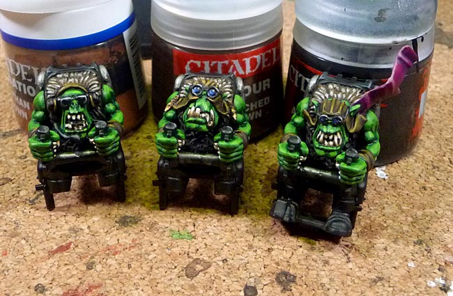
To say there’s a new learning curve is an understatement.
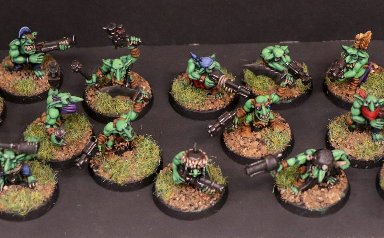
When I was an active painter, and ork player, I had a particular look to my army that was pretty consistent. I loved the brighter, close to neon, greens that are indicative or the early orks. Lots of color and high contrast has always been my style, as seen in the retro selections below.
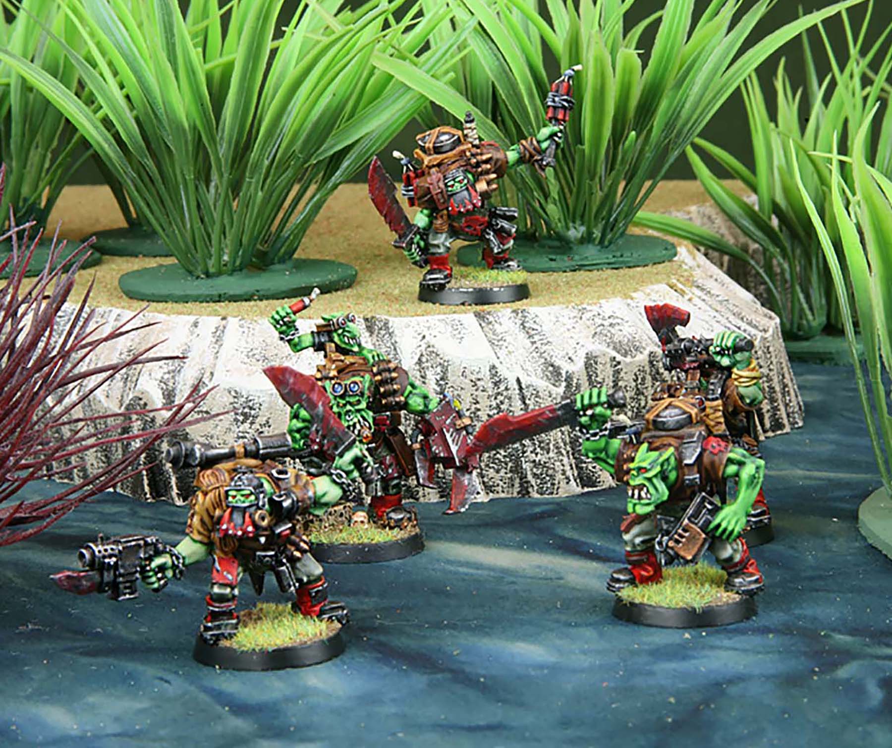
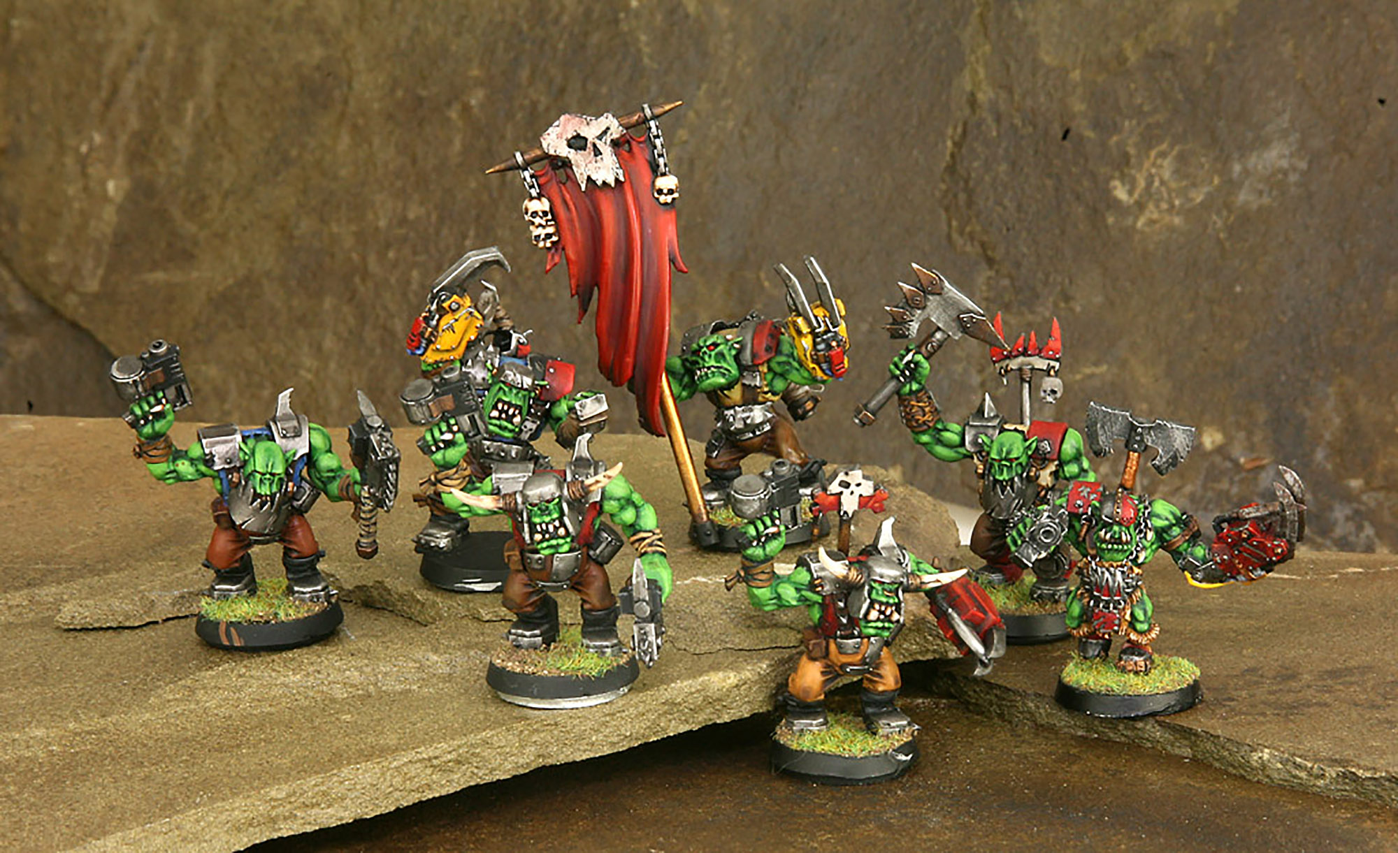

I did have a recipe with seven steps to achieve my particular brand of green. Here’s my old “How To” from back in the day.
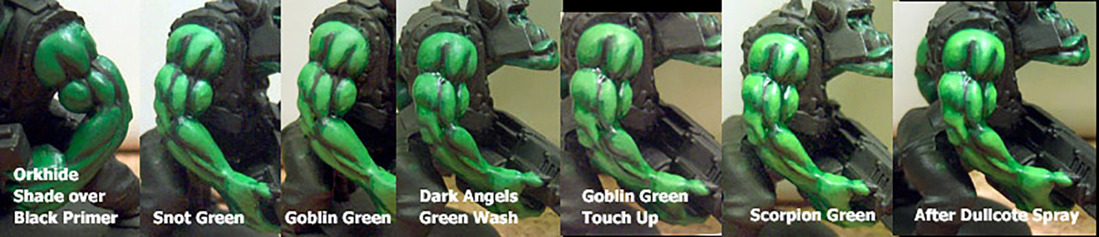
Needless to say, none of these colors exist in this exact form anymore so I had to do some experimentation to find out what particular layers of which colors/brands I needed to achieve my original bright green orks.
I went through six different tries before settling on this path last night.
I started with a primed black mini and based it with a Citadel Color Caliban Green, followed by a 50/50 of Cailban Green and Army Painters Warpaint Fanatic Greenskin. First image is a comparison showing the two different steps.
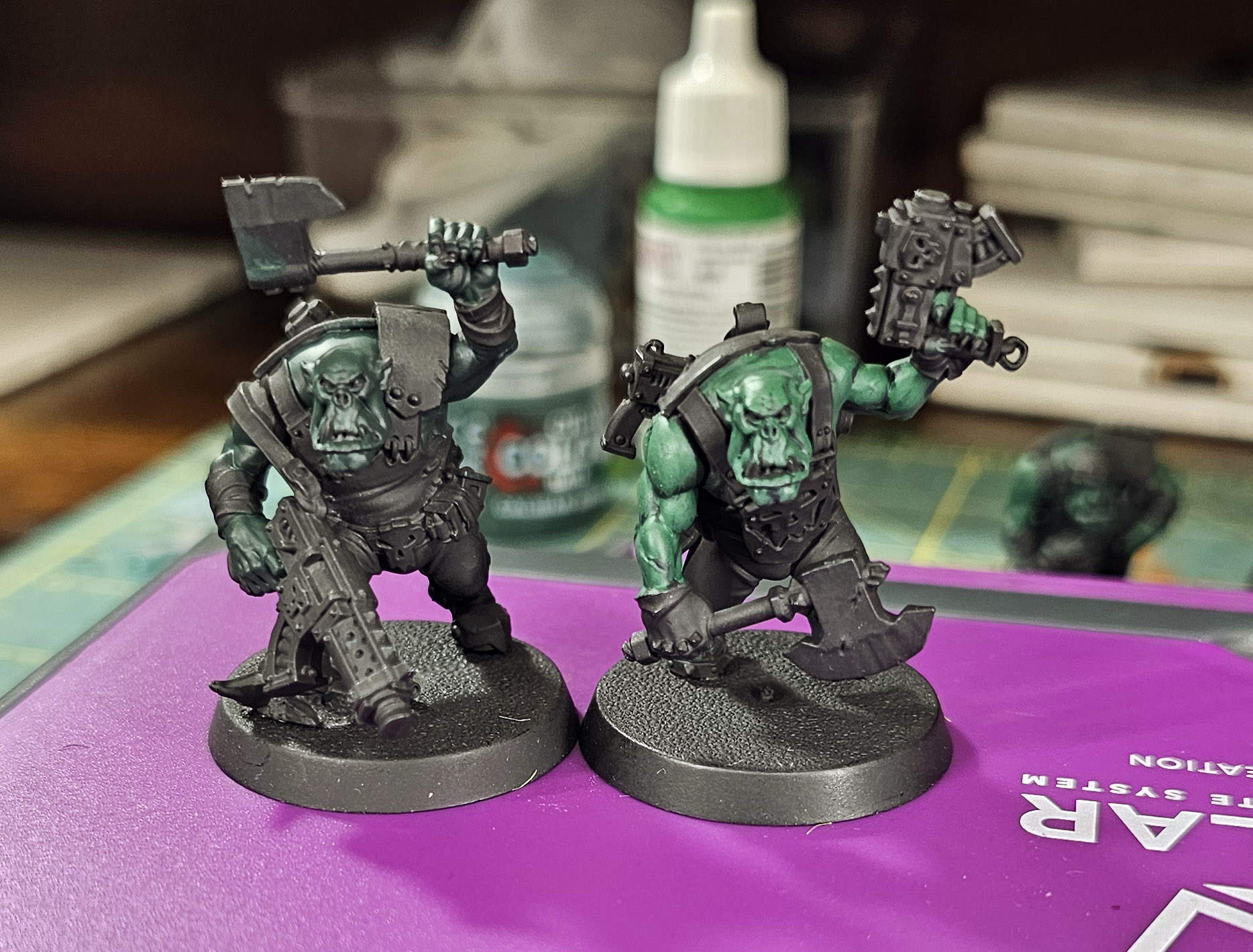
Cailban Green/Greenskin for reference.
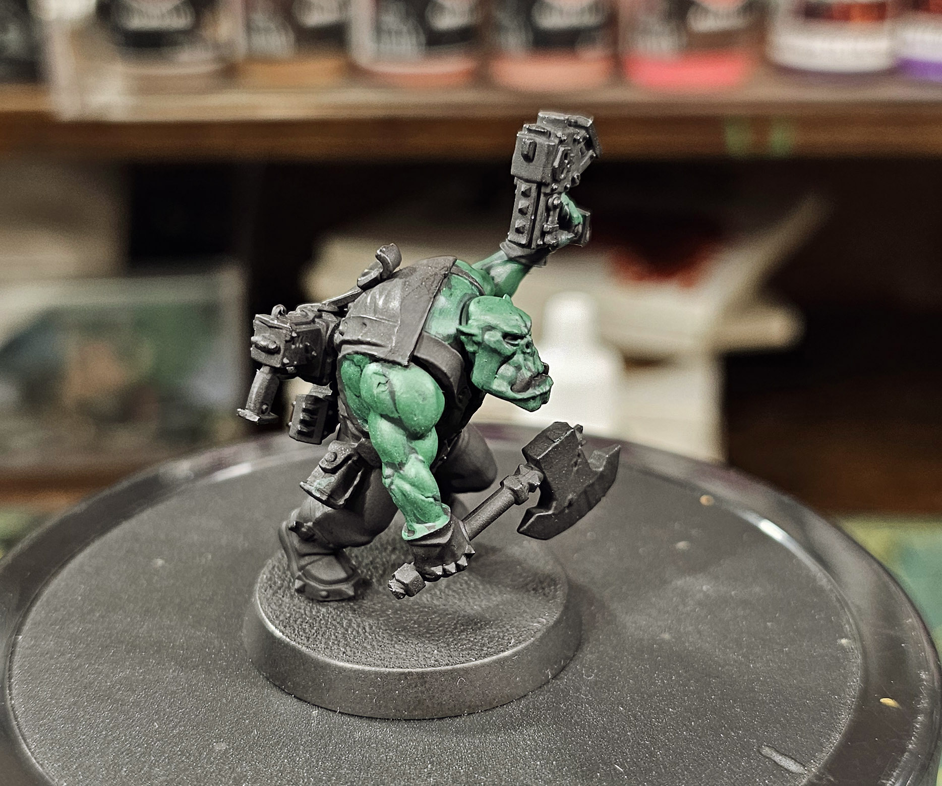
Then, a layer of just the Greenskin. Things getting lighter and brighter already.
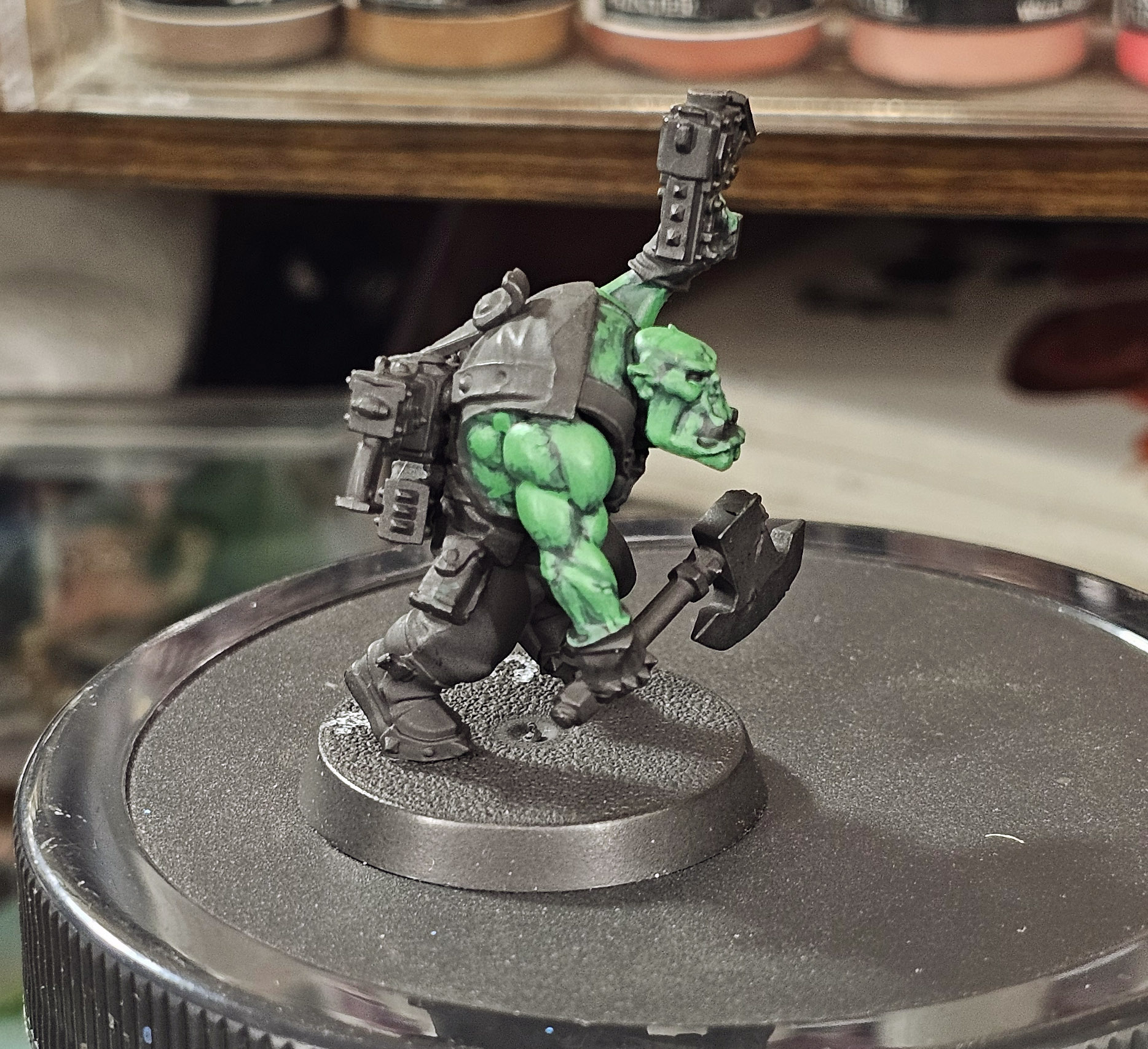
A comparison of the last two steps showing the 50/50 next to the Greenskin top layer.
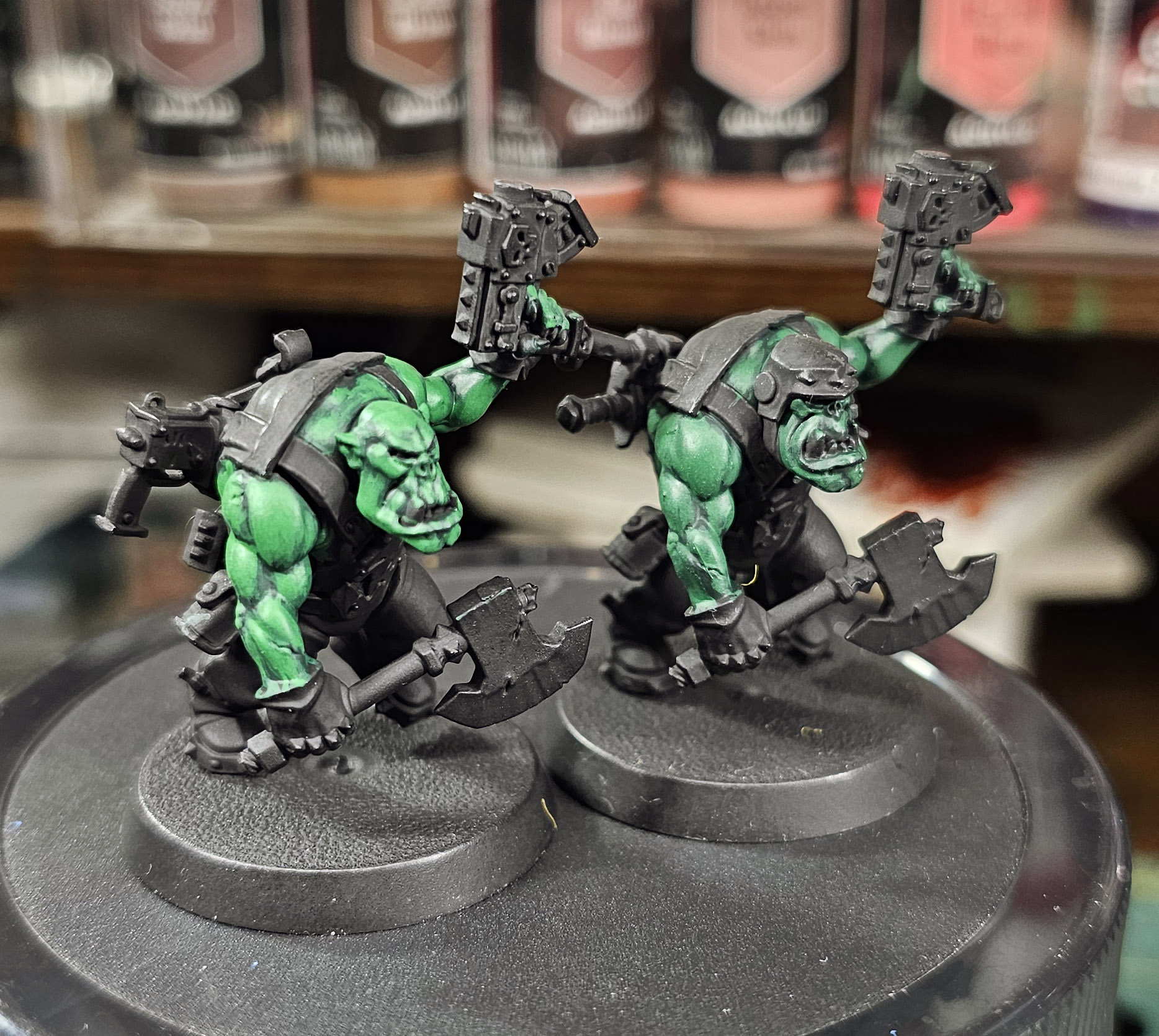
While I’m not getting somewhere, the green is starting to get a little light. leafy in color and I wanted to bring a little more vibrancy back. This meant a wash, or contrast in todays parlance, using Citadels Warp Lighting Contrast paint. This helps blend the last threee layers a little bit, and brings the green to a more vibrant, medium green tone.
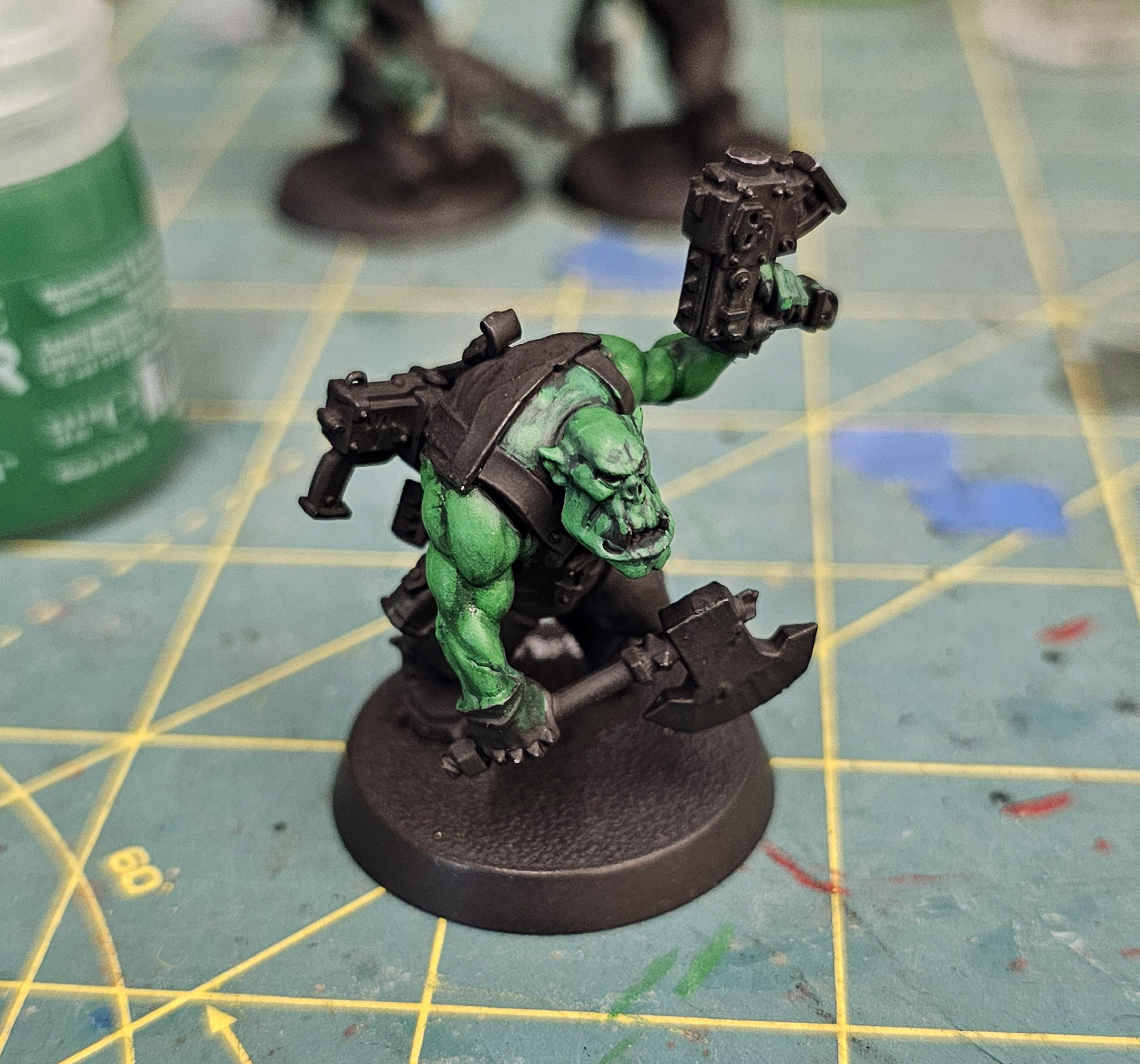
Then….. I just went oof and did some experimentation on the next three layers and didn’t take any pictures. I happens some times, you just get swept up and let the creative juices flow, not caring about photos. Here’s where I ended up.
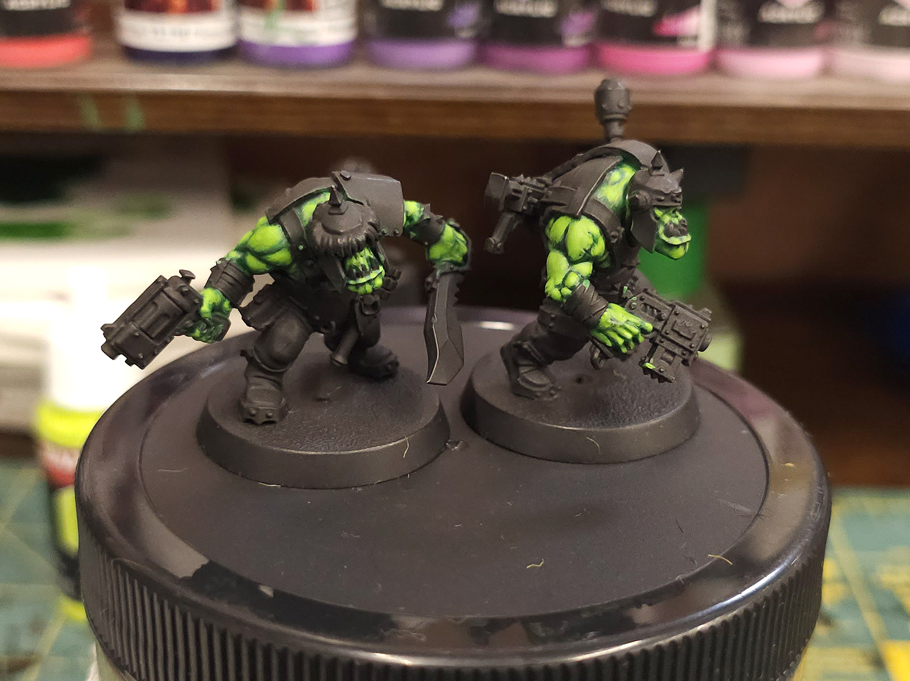
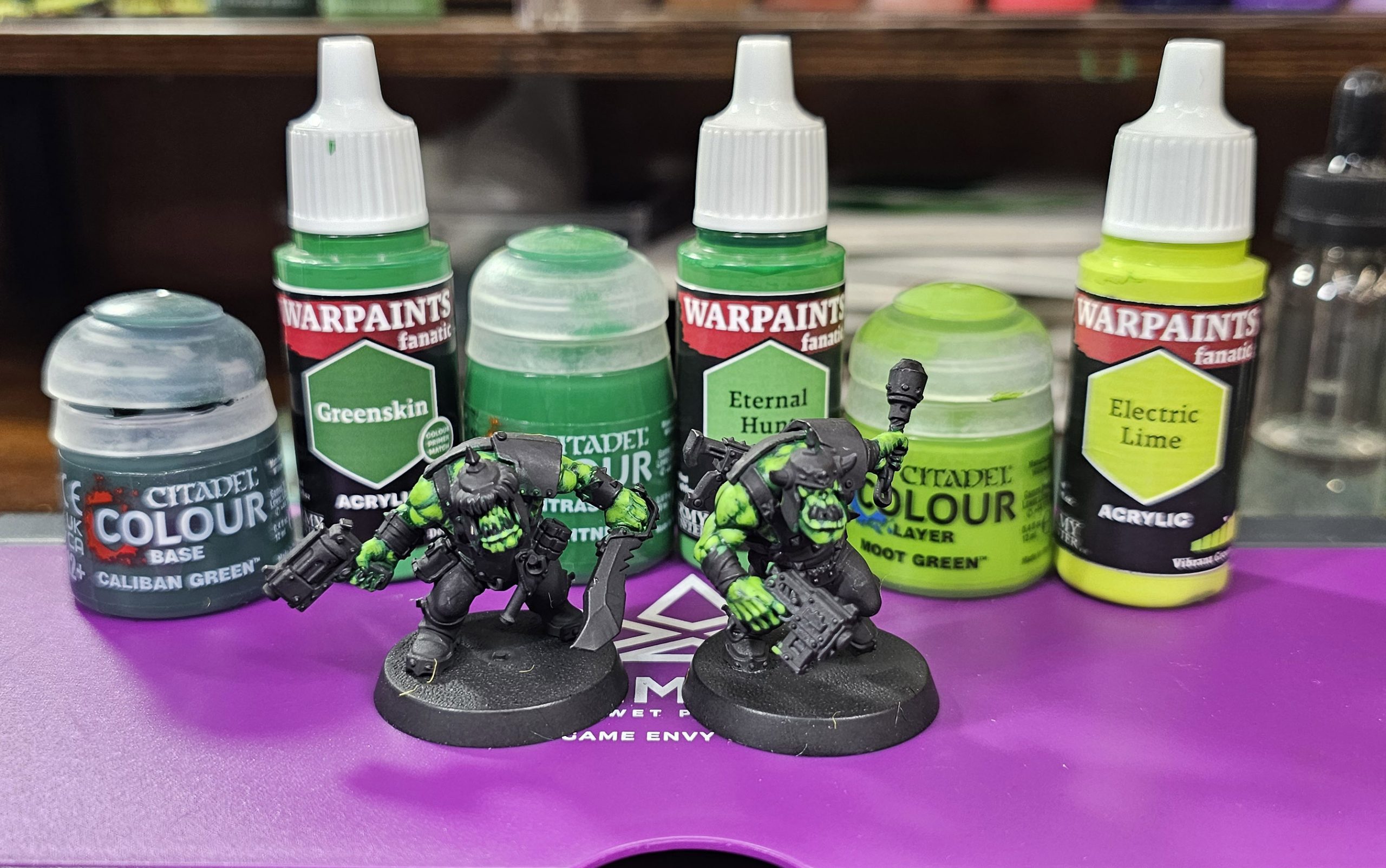
My first layer after the contrast paint was the Army Painter Eternal Hunt. I like this brighter green and it covered well over the wash. Following that isa 50/50 Eternal Hunt/Citadel Moot Green, this was followed by a layer of just Moot Green. The Moot Green is really close to what my previous orks were painted up to, a very neon bright green.
I almost stopped there as it was looking pretty good, but I realized this was under my paint lights. I did a walk around under regular lighting condition in my work area and they color just didn’t quite have that pop I was looking for so I decided to go one step higher, finishing with a light highlight of Army Painters Electric Lime. I’m not too worried about it being too bright. I seal all of my models using Testors Dulcote, which is a great protective sealant, it will also has a tendency to blend transitions a little, and will knock down the brightest colors just a tad.
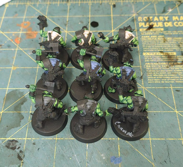
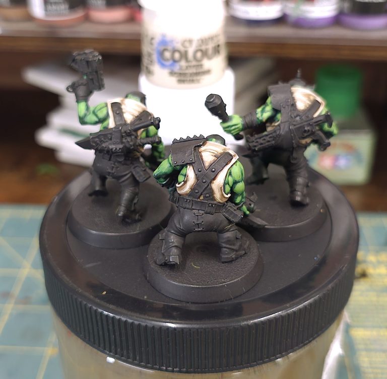
Leaving me with this spread of paints to achieve the bright neon greens of my past. Still seven steps, but I’m happy with the results. now to complete the other seven I started to do a “swatch” selection, if you will, of pant and shirt colors to see how well they go together. I’m looking for 9 total possible combinations for variation across the army, but still enough to have it look cohesive at the end of the day.
RANT TIME
I don’t do this much but I gotta put in a few cents here. I loved the older 3rd edition orks. I’ve painted well over 100 of them in my time. The previous sculpts were a cross between the old 1st/2nd Ed goofiness and trying to make them a bit more menacing. I wasn’t too sure about the new sculpts at first, but realize they are pretty good and decent step forward towards more aggressive, and downright scary looking orks. Besides the scale creep (Primaris Orks, anyone?), the arching of the shoulders with large trapezius muscles takes a way some of the cartoony look of the last editions models.
I’m not hating on the scale creep either. Honestly, I think it helps in painting as there is a lot more room for deeper details, particularly the faces. What I have trouble understating is two sculpting decision: one that was made to make the seams on the push-fit models disappear, and the other because it seems logical on the face of it, but looks weird in execution. This photo shows both.
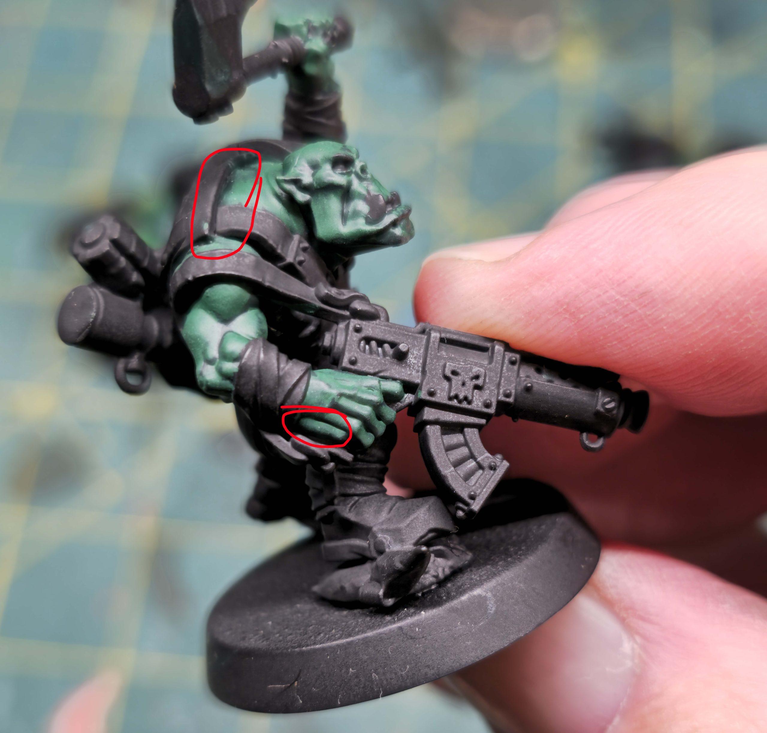
The top circle show where the seam comes together on the push-fit models. They chose to end a piece of cloth/fabric/armor(?) right across that line. It covers the seam very well, but looks odd as hell when trying to figure out what the heck it is! Is it just part of shirt? Many of the models have leather straps (holsters, backpacks) that go through this piece. It can’t be there to keep the leather strap from rubbing and being uncomfortable, right? I mean, they’re orks for Mork’s sake! Of course, this leave the front bare on most models, showing mighty six packs and bulging biceps.
The bottom circle marks another odd design/sculpt decision. I know, in real life, that when gripping a weapon, like a pistol grip or a knife, there’s a certain amount of fleshy palm meat that will squish out and extend past the hand. It seems as though they decided to sculpt this. In reality, it make it looks like this ork has six fingers. Polydact-ork? I know, I know, the real way around this is to just not paint that part and leave it black so it fades into the background and no one notices. That’ what I plan on doing, but still, what were they thinking?
RANT OVER.
I have color swatch set up for the painting of the shirts and paints and will share that with you next time. Until then, keep painting!
Later!